PROJECT DETAILS
Megan Opel Interiors
Branding, Print Suite, Website Design & Development
Megan Opel's design ethos for her eponymous interior design studio is to embrace and celebrate the beauty and chaos of real life. Her goal with her branding was to communicate her style : traditional, coastal, and colorful interiors with a fresh, youthful twist. A personal connection with citrus trees, along with the freshness that they convey, led us to incorporate a hand illustrated lemon branch and tree into the logo artwork.


Brand Elements & Marks
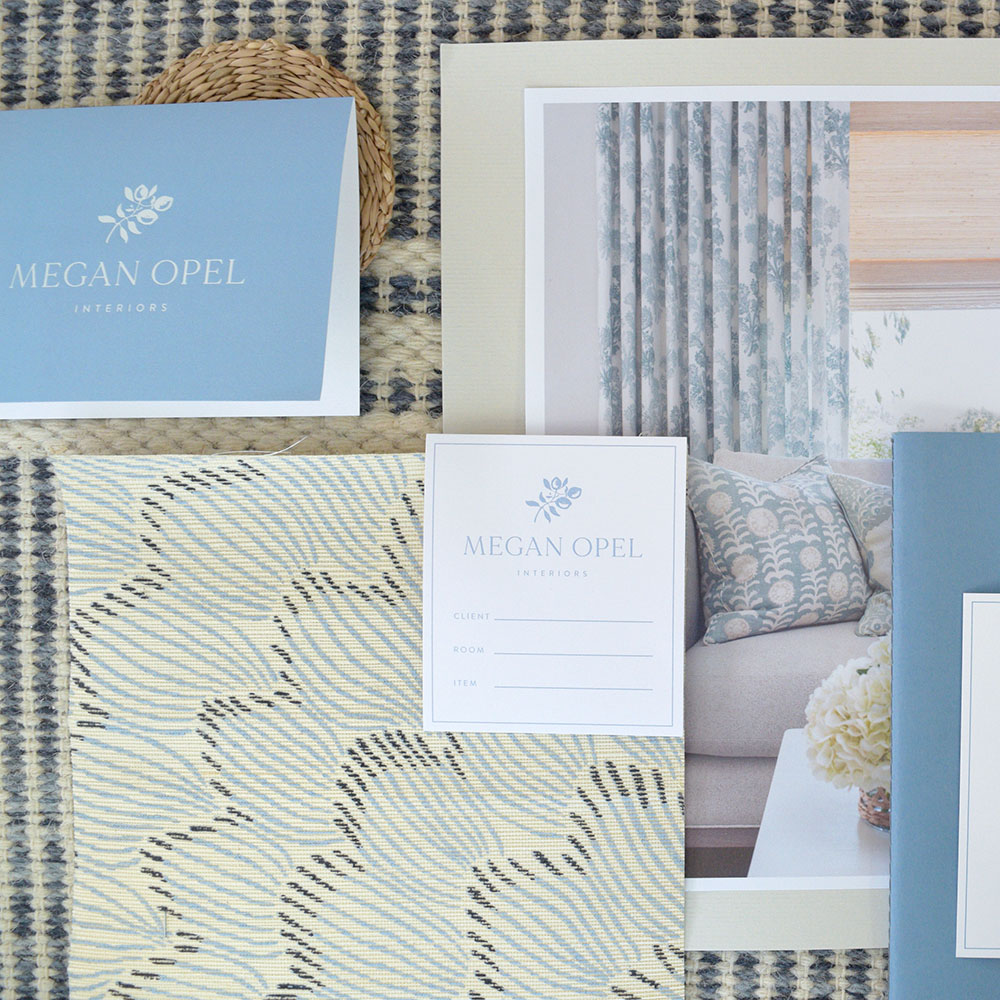
The color palette is inspired by the hues that are frequently incorporated in the coastal, lake front homes that Meg designs: blues and greens, complimented by pale yellow. These colors appear in beautiful saturation in the print materials, as well as color backgrounds on the website. With a love of block prints and hand painted textiles, we created playful patterns, pulling in a potted lemon tree, as well as the signature branch.


More Work


Have a project to discuss?